
Logo Design, Branding
Client
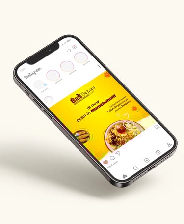
B2b Biryani
Scope
B2b Biryani with love
B2B – Bengal to Bangalore is more than a name; it’s a cultural bridge. The brand identity celebrates Kolkata’s soulful cuisine reimagined in Bengaluru, blending tradition with a modern, memorable design narrative
2023
B2B – Bengal to Bangalore is a brand built on the purpose of connecting two culturally rich cities through the love of authentic Bengali cuisine. With a name that symbolizes both "Bengal to Bangalore" and a strong business-to-business spirit, B2B is driven by the intention to introduce and preserve the essence of Kolkata’s food culture in the heart of Bengaluru. The brand exists to serve not just meals, but memories—bringing comfort, familiarity, and identity to those who miss home, while inviting new audiences to experience the soulful depth of Bengal’s culinary heritage in an honest and meaningful way.
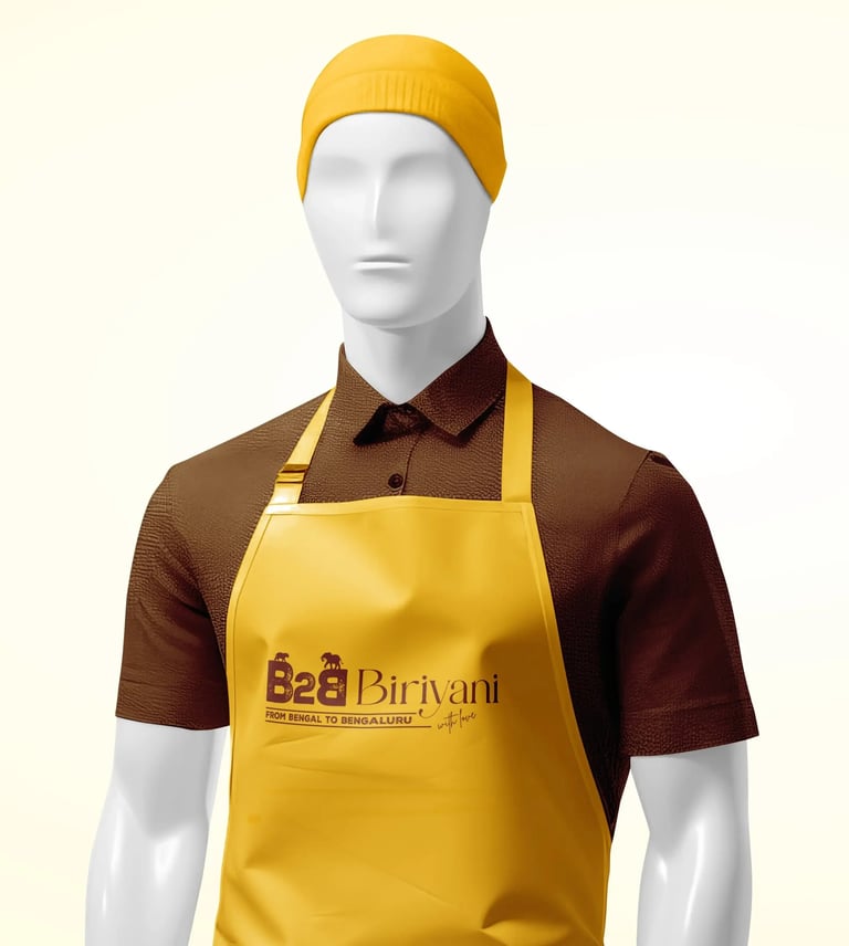
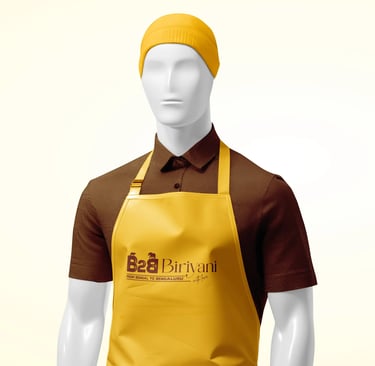
Logo
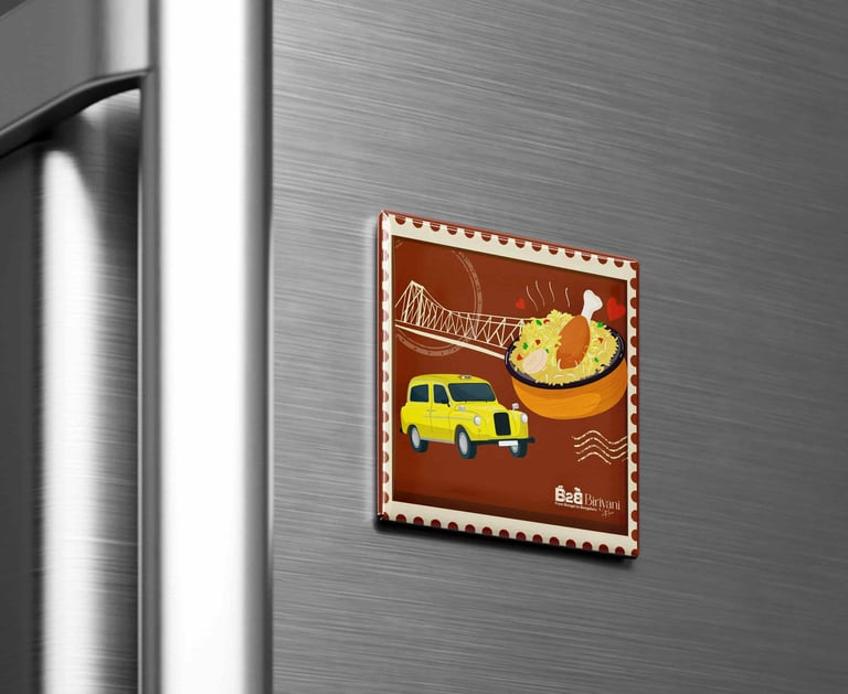
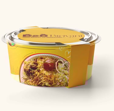
This logo for B2B Biriyani is creatively designed to represent the journey “From Bengal to Bengaluru.” The bold B2B uses a distressed texture and incorporates a tiger and elephant—symbols of Kolkata and Karnataka (Bengaluru) respectively—cleverly sitting atop the letters to reflect regional identity. The elegant “Biriyani” typography balances the boldness with a refined feel, while the tagline “with love” adds a personal, heartfelt touch to the brand's story.

Kolkata
Karnataka
name
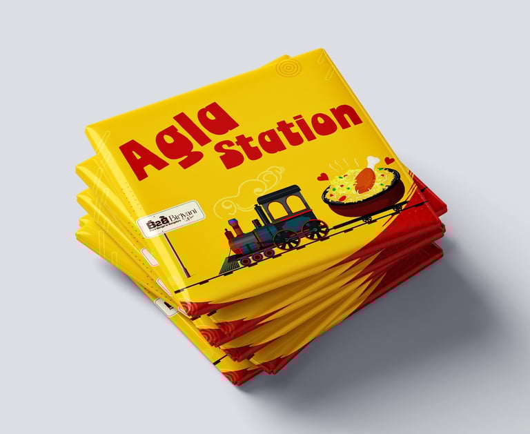
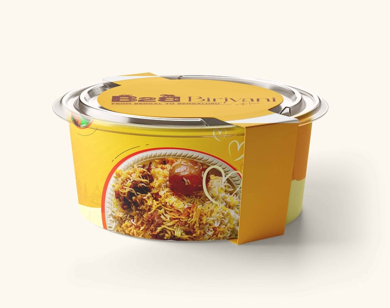
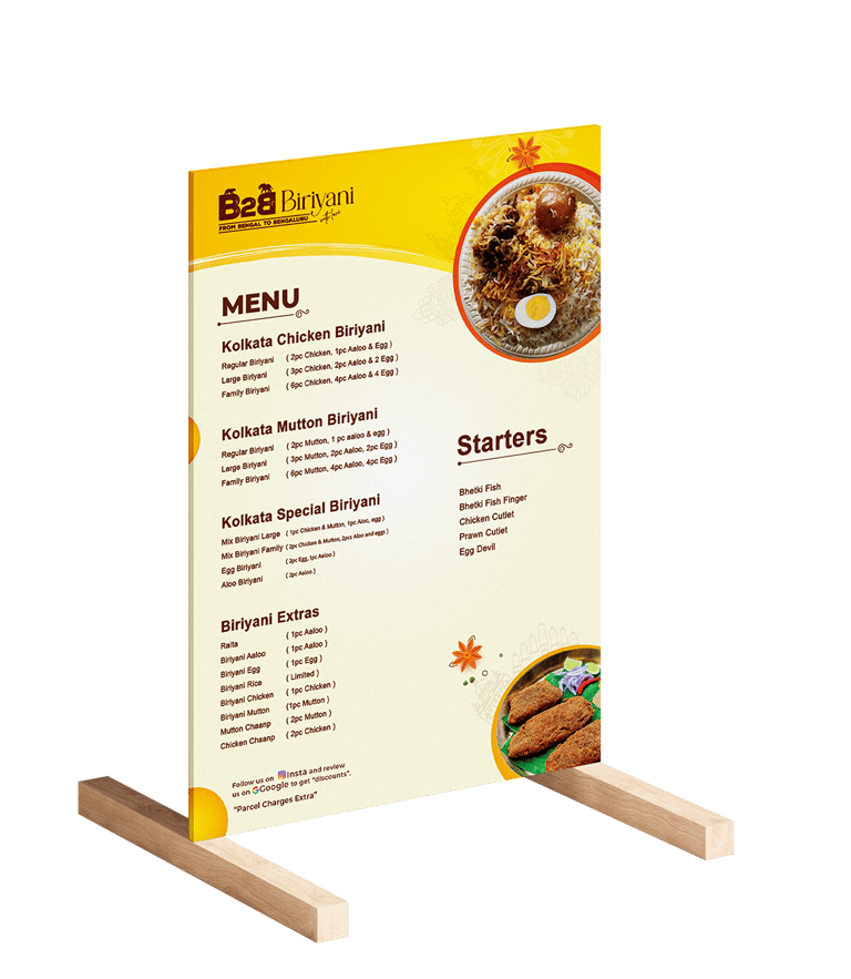
The yellow and brown colour scheme beautifully reflects the essence of a food brand that bridges Kolkata and Karnataka. Yellow ignites the soul of Kolkata — vibrant, flavourful, and full of life, much like the city's iconic street food culture. Brown, on the other hand, grounds the spirit of Karnataka — earthy, rich, and authentic, echoing its deep-rooted culinary traditions. Together, these colors create a warm and inviting harmony, blending bold spices with comforting flavors. This palette is more than just aesthetic; it’s a visual celebration of India’s diverse and delicious regional cuisines.
Colour Scheme
#6b1e0b
#fcbb00


Previous Project
Next Project


Work
About us
Services
Careers
Contact Us
Blog
Youtube
Linked in
©BigCat Creatives 2019–2025 all rights reserved
Hyderabad, India, Asia